2022-02-24
There are many kinds of interesting animals in this world. The creativity of nature is fantastic, and human ingenuity can hardly compare.Animals are cute, strong, beautiful, and most importantly, each animal is unique. People are fascinated by animals; whether we feel love or fear, we will always be impressed by the charm of animals.
Animals, as a matter of course, become inspirations for packaging designers. Here we have selected five animal-inspired packaging designs to share with all the packaging enthusiasts:
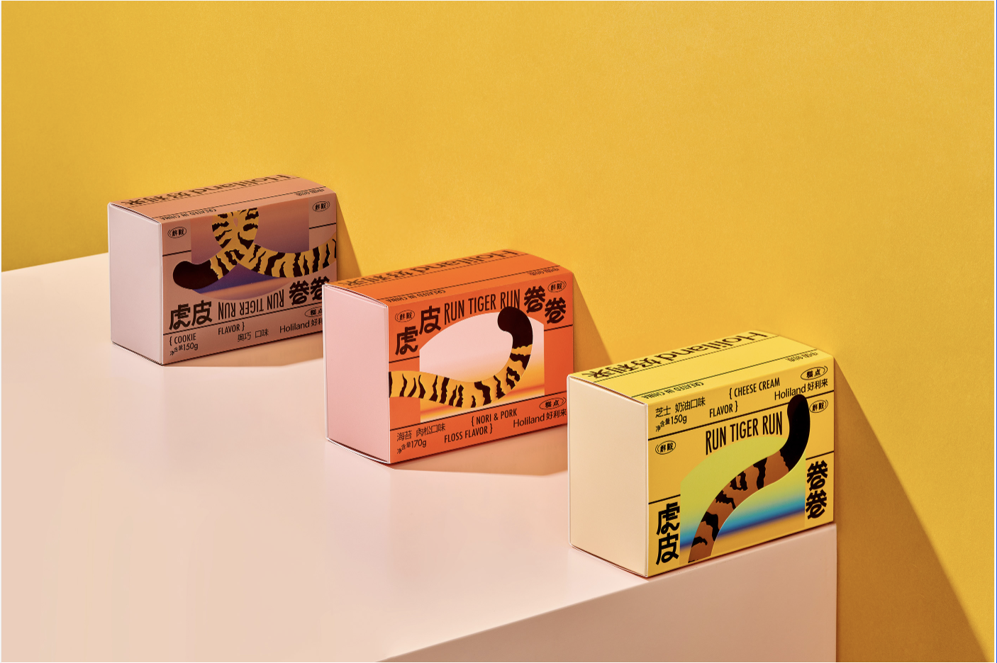
This year is the Year of the Tiger, so here we present you the packaging of tiger pattern cake rolls. The beaten egg yolk shrinks rapidly due to high temperatures, and the beautiful texture of the tiger pattern will show on the cake. Of course, the container for the tiger pattern cake must also simulate the attractive tiger stripes.
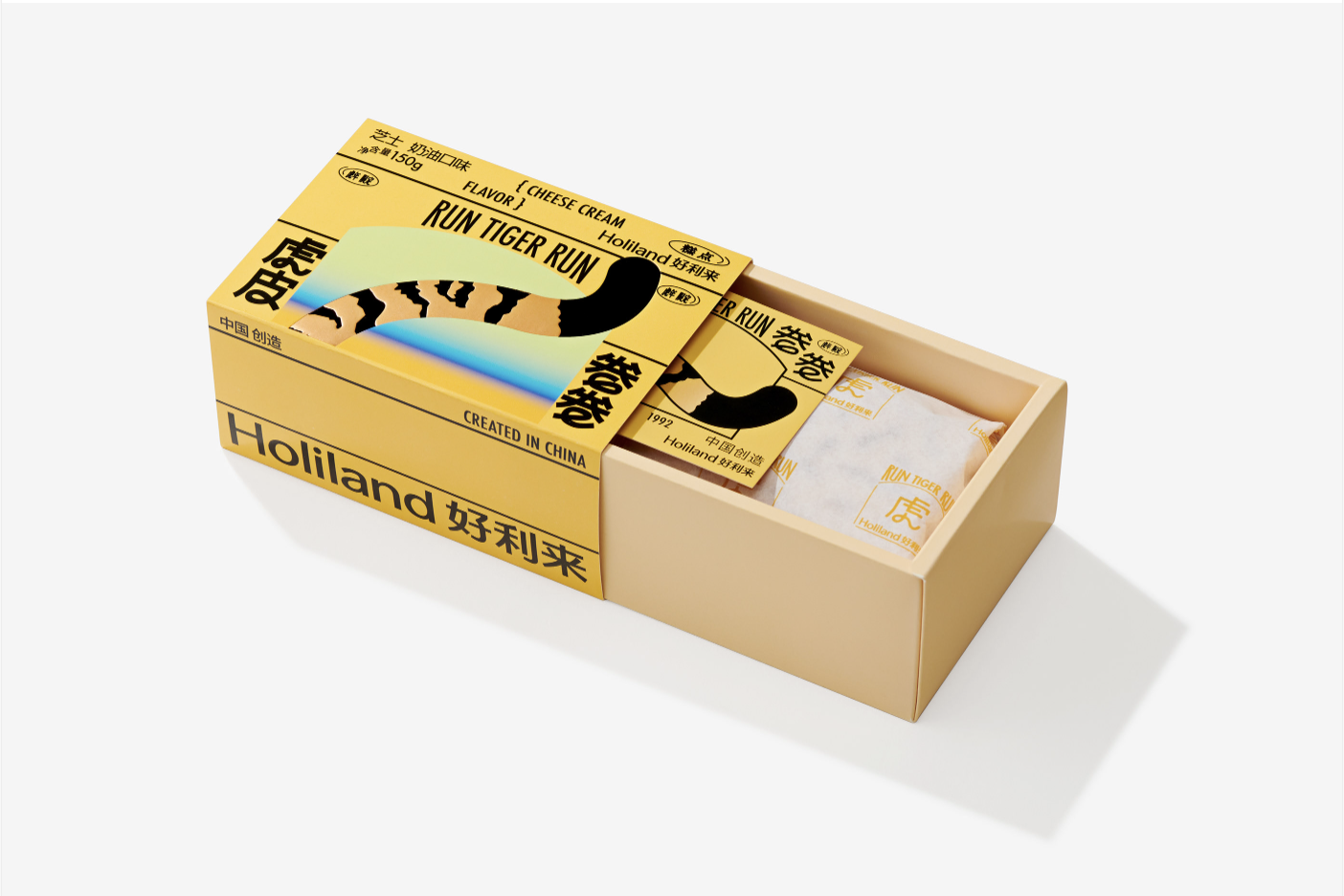
Beijing-based designer DONG_11 took advantage of the tiger stripe contrast to design this packaging for Holiland. DONG_11 uses the curly tiger tail as the primary visual illustration and takes inspiration from the tiger’s color in the standard color scheme. In addition, a fine dent is made on the tiger tail pattern, which adds richness to this packaging.
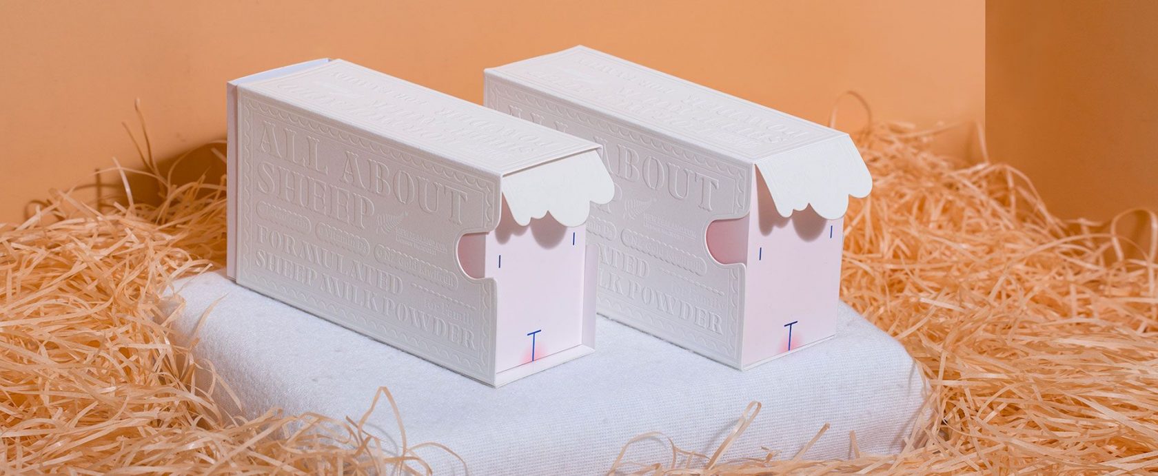
Moving on from the tiger pattern packaging, let’s introduce the packaging for this sheep milk powder. It was designed by L3 Branding to look like a soft white sheep, and this special shape will surely turn heads on the store shelf.
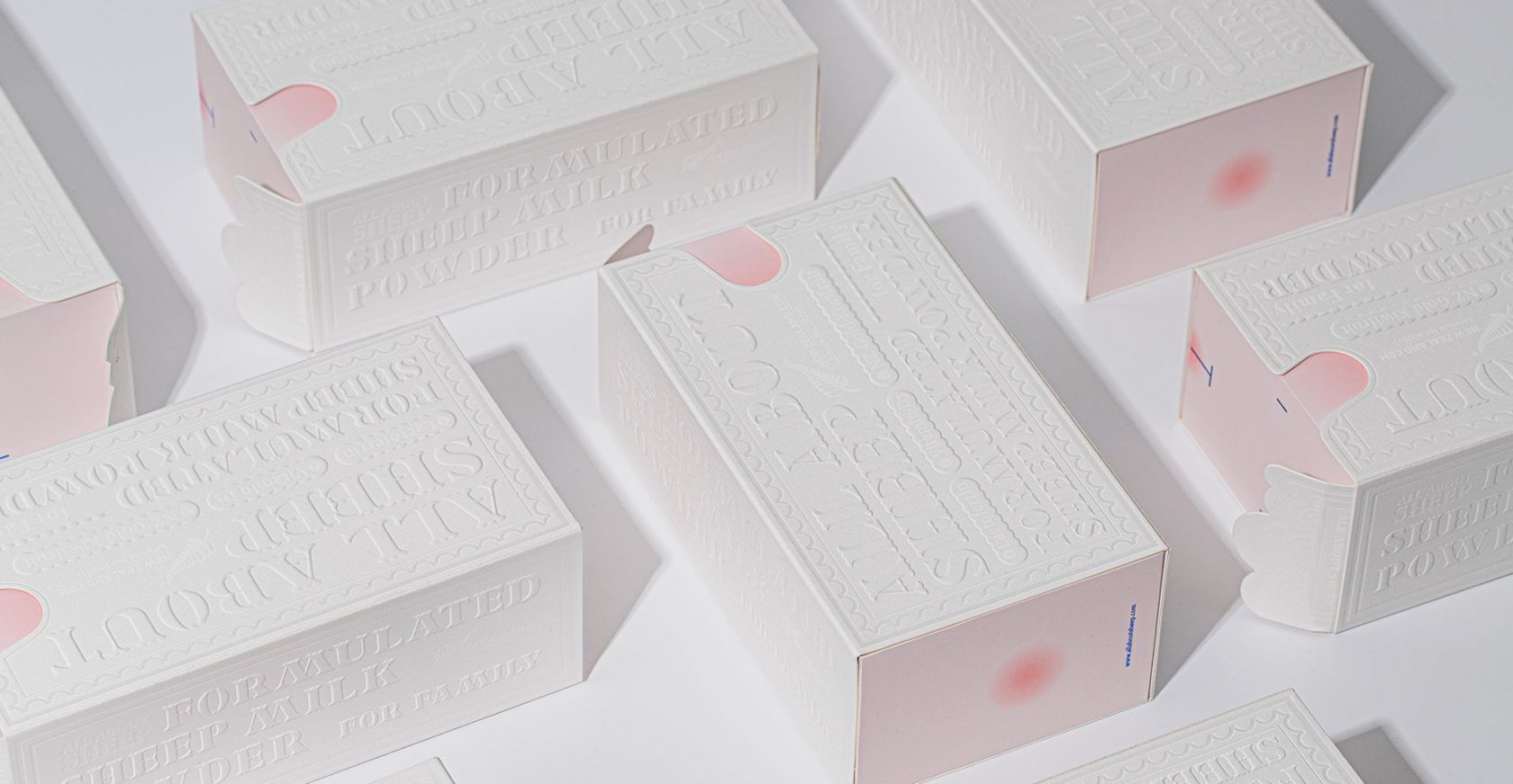
L3 Branding used a drawer structure with sleeves for the main packaging. The sleeves are embossed with the information about the product, this embossing technique also simulates the feel of wool. The front of the drawer is printed with the facial features of a lamb, the back includes a small lamb tail pattern, and the drawer’s handle is shaped like the tiny bangs over the sheep’s face.
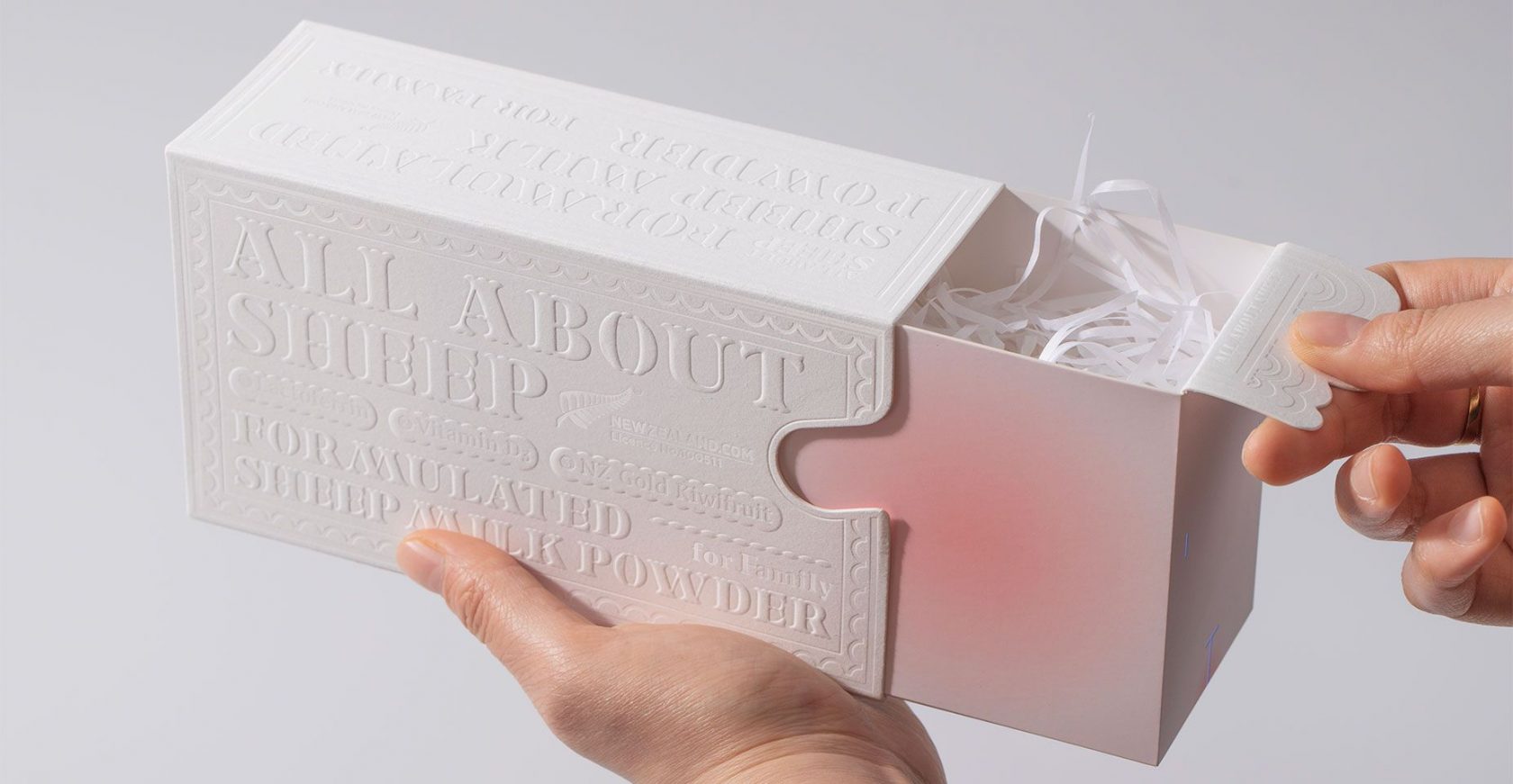
L3 Branding combines structure and design to present this cute and practical lamb design, which is not only unique and eye-catching but also easy to mass-produce, taking into account both commercial and artistic considerations.
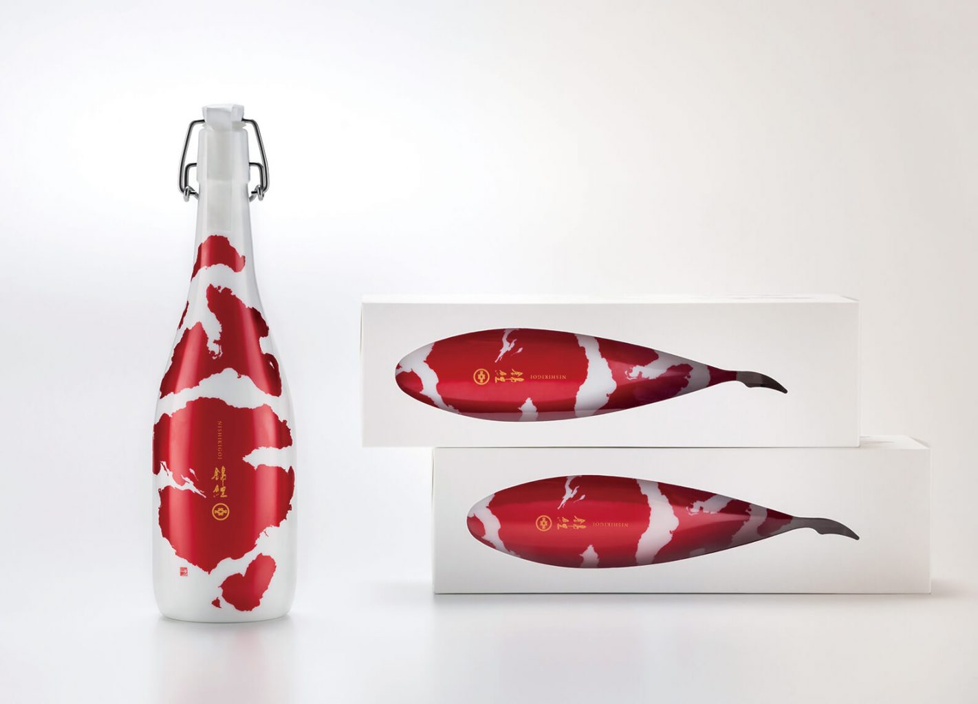
Punching holes in packaging stems from the desire to allow consumers to see the product at a glance. Japanese designer Aya Codaama used this technique to create packaging for the Japanese “Koi” sake.
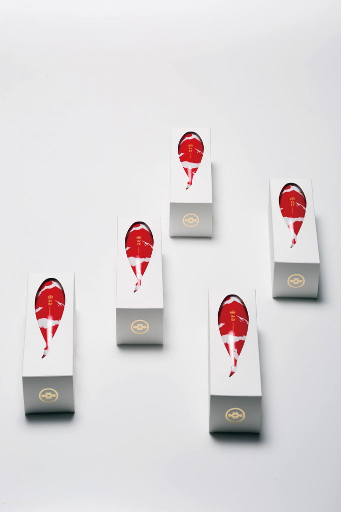
A fish-shaped hole is punched into an ordinary rectangular carton, and unique red and white watercolor pattern of koi is printed on the sake bottle. When consumers take the bottle out from the packaging, the moment of sliding the bottle out is like a koi swimming forward in the water. A little thought adds dynamism to the unboxing experience, while brings it to life.
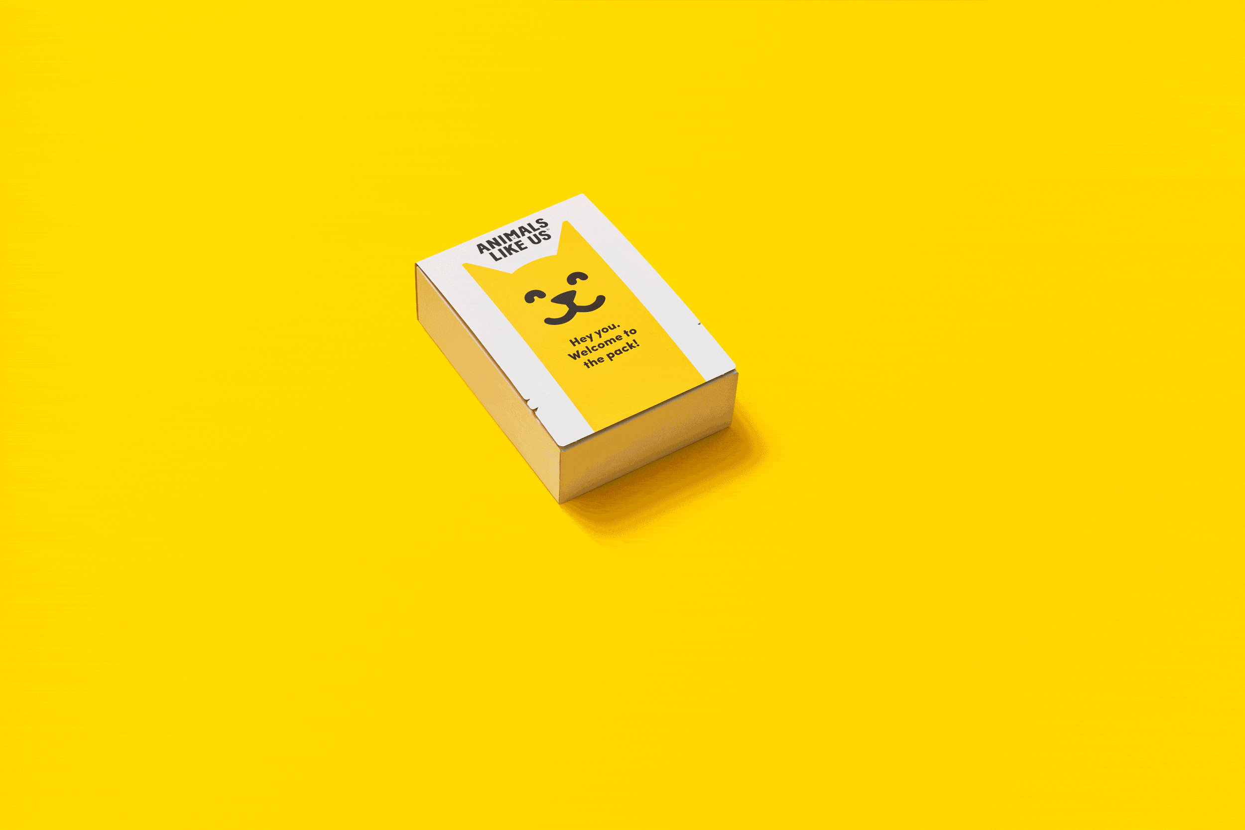
This pet food packaging is from one of our favourite structural designers, Think Packaging. When you see this packaging on the store shelf, it looks like a regular rectangular carton box with an illustration of a dog’s face. However, when you tear the seal and open the package, you will be pleasantly surprised to find that this package turns into a dog lying down on his back with pet food on his stomach.
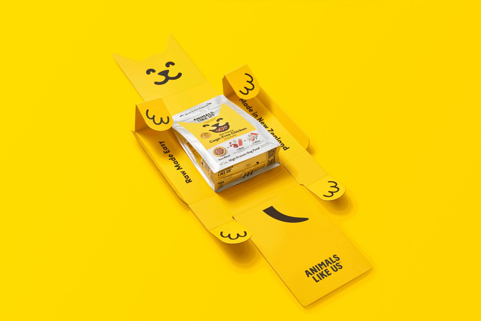
How adorable is that! Not only is it cute, but this packaging is also a metaphor that suggests your dog will be happy enough to roll around all fours after eating his dinner. Think Packaging presents this design with the hope that it will be impossible for consumers not to smile when they experience it. This design is full of childlike innocence, and the unboxing experience is both unique and unforgettable, which leads to great brand recognition.
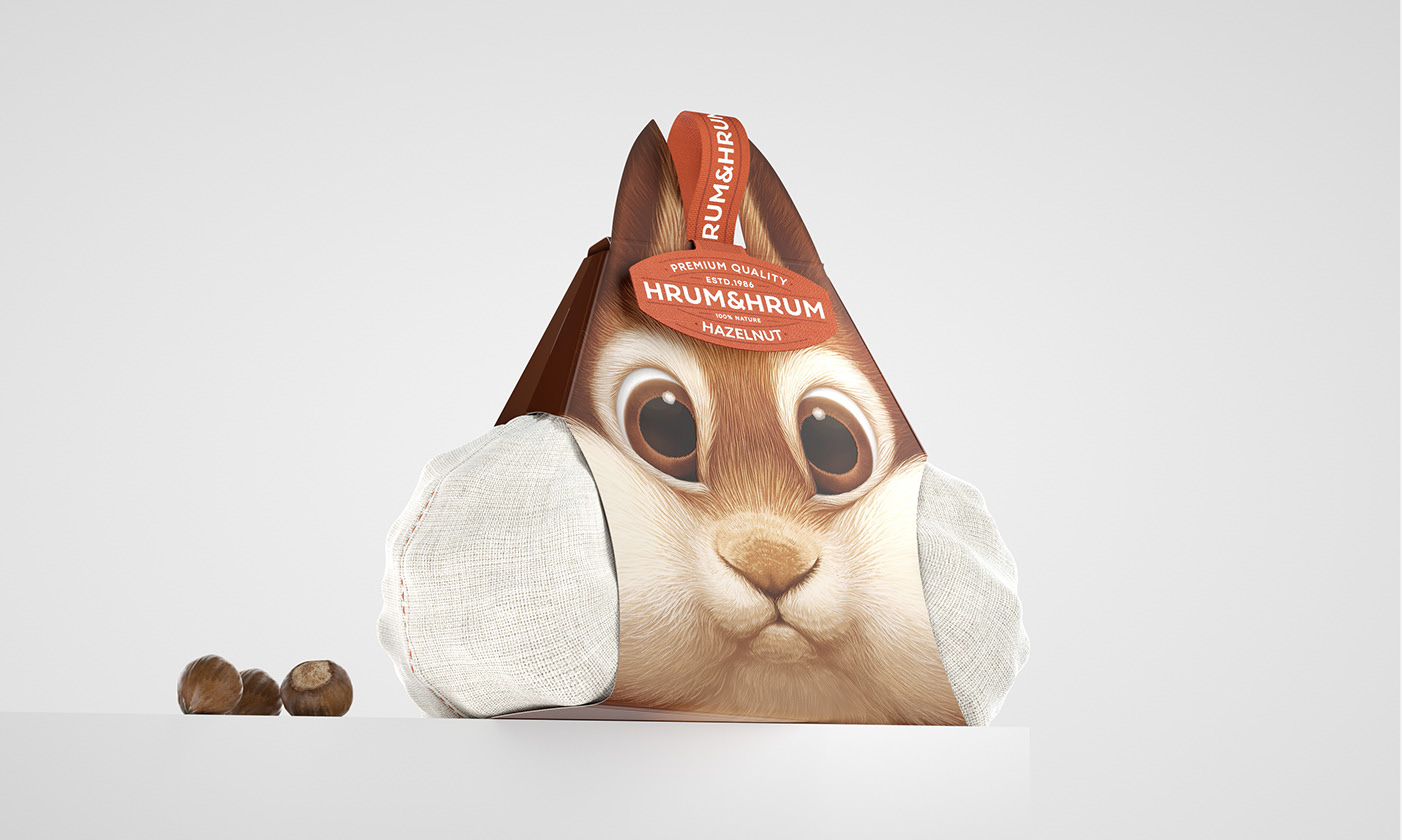
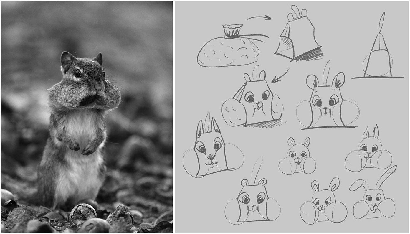
Which animal loves to eat nuts the most? Presumably, everyone has a picture of squirrels holding nuts and gorging coming into their minds! Russian designer Constantin Bolimond designed this packaging for the nut brand HRUM&HRUM so that people will smile knowingly. The combination of printed cardboard and cloth bags shows the timeless appearance of a squirrel with puffy cheeks.
★Fudy does not own the copyright to the above example.

FUDY SOLUTIONS
FUDY SOLUTIONS 3054 Lawrence Expy Santa Clara, CA 95051 USA