
2021-10-20
The winner of the Branded Packaging Gold Award at the 2014 DBA Design Effective Awards was a unique pharmaceutical company, ‘Help Remedies’. General pharmaceutical packaging mainly adopts a professional and authoritative image to persuade consumers by explaining the complicated effects of their drugs. ‘Help’ Remedies, on the other hand, adopts a “less is more” layout design, which directly refers to consumers’ pain points and simply informs the consumers if this medication is the right choice to alleviate their symptoms.
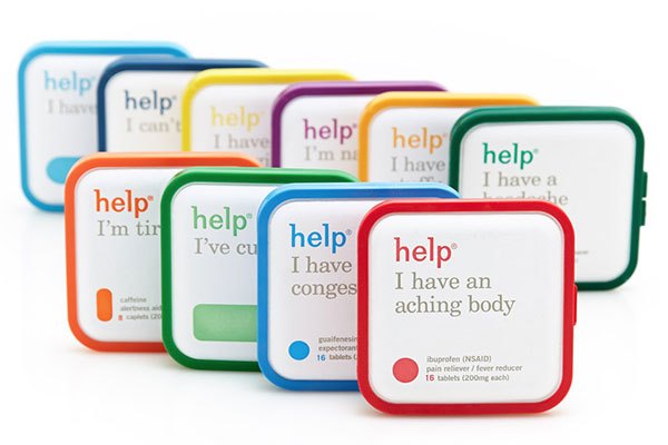
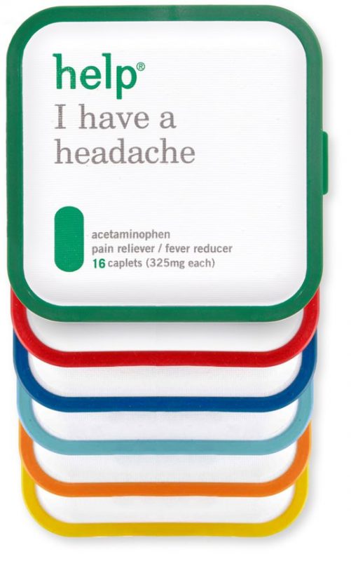
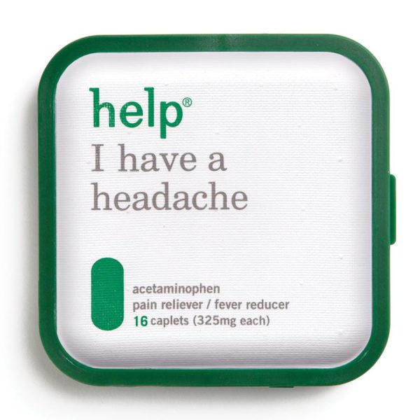
The appearance of the ‘Help’ product is a white molded pulp with a saturated monochromatic plastic frame. On the packaging, the symptom and numbers of the pills are written in concise and easy-to-read large letters, and the shape of the medicines are marked with a picture. Help’s packaging design is simple, eye-catching, and easy to identify, as described in its brand statement:
“Help is a new type of drug company, a drug company that promises you less.”
From the appearance of Help’s product packaging, we can identify that this pharmaceutical company wants to provoke feelings of empathy rather than professional authority. They understand that consumer doesn’t need inexplicable medicinal effects or complex pharmaceutical ingredients. Instead, they want a prescription that can solve their symptoms. Therefore, ‘Help’ chose to design their packaging from the consumers’ point of view so that they can easily identify the right cure for illness at a glance.
Help Remedies promises their consumers that they will only get what they need from ‘Help’, no more and no less. Thus, as soon as the consumers see the ‘Help’ packaging, a dialogue between ‘Help’ and the consumer has started.
Nathan Frank, the founder of Help Remedies, once said:
“Our packaging is our most important piece of communication. Pearlfisher has done a great job in enhancing our identity so that it communicates everything we have to say without having to spell it out, literally.“
In this competitive consumer society, the function of product packaging is no longer just to protect products. More importantly, the focus has shifted to attracting consumers’ attention, strengthening brand image, increasing brand value, and differentiating this product from competing products. Therefore, to establish whether a product is successful or not, establishing the product symbolic value from the outer packaging in addition to the product’s inherent practicality, is often the key to victory.
The launch of Help Remedies’ product has started an innovative trend over-the-counter medicine brands. Many pharmaceutical companies began to use new ways to communicate with consumers. From this, we can learn that packaging does indeed initiate the most immediate first step in consumer behavior. If we want to sell the product successfully, we cannot give up any opportunity to develop a conversation with consumers.
There are more discussion about ‘Help Remedies’. Stay tuned.
Power for the Possible!We are Fudy, your packaging consultant.
Source 1|help remedies face book
Source 2|DBA Design Effective Awards (2014)

FUDY SOLUTIONS
FUDY SOLUTIONS 3054 Lawrence Expy Santa Clara, CA 95051 USA